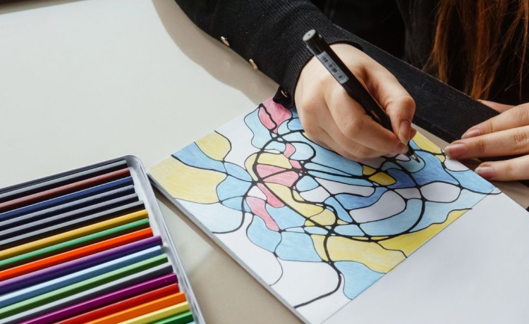
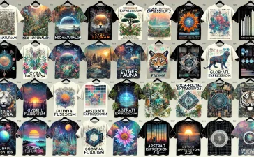
Colour is a powerful tool in the hands of a surface designer, capable of eliciting emotions, shaping perceptions, and enhancing the visual impact of creations. The psychology of colours plays a crucial role in guiding designers toward crafting designs that resonate with their audience on a deeper, emotional level.
Understanding the psychological impact of colours is fundamental to successful surface design. Each colour carries its own set of emotions and associations. For instance, warm colours like reds and oranges are often associated with passion and energy, while cooler tones like blues and greens evoke calmness and tranquility. By tapping into these associations, surface designers can strategically choose colors that align with the intended emotional response for their designs.
One essential aspect of colour psychology in surface design is the ability to create a narrative. Colours tell a story, and skilled designers use this narrative to guide the viewer through a visual journey. For instance, a nature-inspired palette of greens and browns can transport the viewer to a serene forest, while vibrant reds and yellows might evoke the energy of a bustling urban landscape. By understanding the emotional connotations of colors, designers can weave compelling narratives into their creations.
Furthermore, designers can establish a distinctive identity by developing signature colour palettes, just as artists are recognised for their unique styles. This involves consistently using a set of colors that becomes synonymous with the designer’s brand. The goal is to create a visual language that, when encountered, immediately connects the audience with the designer’s work. Think of Yves Klein’s iconic International Klein Blue or the vibrant, bold hues associated with the works of Frida Kahlo. These artists have left an indelible mark through their intentional use of color.
Creating a signature colour palette involves a deep exploration of personal preferences, brand identity, and the emotional impact one wishes to convey. The selected colours should not only resonate with the designer but also align with the themes and messages encapsulated in their work. This distinctive colour identity becomes a powerful branding tool, making the designer’s creations instantly recognisable.
Consider the success story of renowned fashion designer Christian Louboutin, known for his signature red-soled shoes. The use of a bold, vibrant red has become synonymous with the brand, creating a visual imprint that resonates with fashion enthusiasts globally. This deliberate choice of colour not only enhances the aesthetic appeal of the designs but also serves as a powerful branding element.
In conclusion, the psychology of colours in surface design is a multifaceted journey that involves understanding the emotional impact of each hue, creating narratives through color choices, and establishing a distinctive identity with signature palettes. Surface designers have the opportunity to harness the profound influence of colours to evoke emotions, convey messages, and leave a lasting imprint on the viewer’s mind. Just as artists are remembered for their unique styles, surface designers can carve out a niche by masterfully wielding the brush of colour psychology in their creative endeavors.
Want to learn more?
- Find out more
- Launch Pad + Accelerator Expressions of Interest
- Selling and Licensing Your Art & Designs Around the World with ArtSHINE.
We’re here to help you to take action, just like we’ve helped thousands of other entrepreneurs, business owners, and creative professionals all around the globe.
Now is the time to let your passion SHINE.
Now is the time to Make Tomorrow Today!
To your success, Vinh Van Lam and Stuart Horrex Cofounders
ArtSHINE.com


