
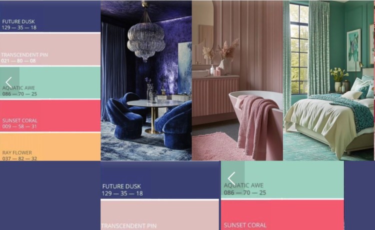
Collage image credit to: Living Bright Interior
As we approach 2025, colour forecasters have set their sights on “Future Dusk” as the standout shade of the year. This mesmerizing hue is a rich blend of deep violet and midnight blue, offering a sense of mystery and sophistication that’s poised to redefine design and fashion trends in the coming year. Described as both calming and bold, “Future Dusk” speaks to our collective desire for introspection and exploration as we navigate an ever-changing world.
While the official Pantone Color of the Year won’t be announced until December 2024, this article delves into the predictions made by colour experts who base their forecasts on extensive research, cultural shifts, and trend analysis. Their process considers everything from emerging technologies and art movements to societal moods, providing a glimpse into what could dominate the aesthetic landscape.
Will “Future Dusk” become the colour that defines 2025, or will Pantone reveal something entirely unexpected? This speculative forecast invites us to explore the potential of this evocative shade while we wait to see how close these predictions come to the official selection!
The Evolution of Colour Trends
Before we delve into the richness of Future Dusk, it’s worth noting how colour trends can surprise us. Cast your mind back to when “Peach Fuzz” was first introduced – it was met with skepticism by many. Yet, as we enter the fall of 2024, we see this warm, nurturing hue being fully embraced, serving as a base in numerous spaces. This journey from doubt to acceptance reminds us of the transformative power of colour in design.
Future Dusk: The Colour of 2025
Future Dusk represents more than just a colour; it embodies a mood, a zeitgeist. This captivating hue marries the depth of violet with the mystery of midnight blue, creating a colour that speaks to our collective desire for escapism and transformation. In a world that’s constantly evolving, Future Dusk offers a visual respite – a colour that allows us to pause, reflect, and dream of possibilities.
Characteristics of Future Dusk:
- Rich and immersive
- Blends reality and fantasy
- Evokes mystery and sophistication
- Versatile in application
Applying Future Dusk in Design:
- Living Rooms: Use as a feature wall to create a dramatic focal point.
- Bedrooms: Incorporate in bedding and drapery for a serene, dreamy atmosphere.
- Accents: Introduce through accessories like cushions, rugs, and artwork for touches of elegance.
The Complementary Palette
While Future Dusk takes center stage, it’s supported by a cast of equally compelling colours that together form a versatile and inspiring palette for 2025.
1. Transcendent Pink
This soft, ethereal hue brings a sense of calm and tranquility to any space. Transcendent Pink aligns with the ongoing trend of creating wellness-oriented environments.
Usage Ideas:
- Paint bedroom walls for a peaceful retreat
- Incorporate in bathroom tiles for a spa-like ambiance
- Use in living spaces through throw pillows and decor items
2. Aquatic Awe
A vibrant, deep blue that captures the essence of the ocean, Aquatic Awe injects energy and vitality into designs. It speaks to our desire to connect with nature and bring outdoor elements indoors.
Application Suggestions:
- Use on kitchen cabinetry for a bold, modern look
- Incorporate in bathroom tiles for a refreshing coastal vibe
- Add as an accent colour in living areas through furniture and artwork
3. Sunset Coral
Warm and vibrant, Sunset Coral evokes the colours of a setting sun. This hue brings energy and warmth to spaces, making it ideal for creating inviting environments.
Design Applications:
- Paint living room walls for a warm, welcoming atmosphere
- Use in dining areas through table linens and chair upholstery
- Incorporate in outdoor spaces with cushions and planters
4. Ray Flower
Bright and cheerful, Ray Flower is a yellow that brings joy and positivity to any space. It’s perfect for adding a touch of sunshine to interiors.
Incorporation Ideas:
- Use on kitchen cabinetry for a bright, cheerful space
- Add to bedrooms through bedding and decor accents
- Incorporate in living areas via rugs and curtains
Creating Harmony with the 2025 Palette
The beauty of this palette lies in its versatility and the way each colour complements the others. Here are some tips for creating harmonious designs using these colours:
- Balance Bold with Neutral: Use Future Dusk as a statement colour, balanced with neutral tones to prevent overwhelming the space.
- Layer Colors: Create depth by layering different shades. For example, use Transcendent Pink as a base, with Future Dusk accents and Ray Flower highlights.
- Consider Light: Remember that colours can appear different depending on natural and artificial light. Test colours in the intended space before committing.
- Use the 60-30-10 Rule: Apply your dominant colour to 60% of the space, a secondary colour to 30%, and an accent colour to 10% for a balanced look.
- Experiment with Textures: Incorporate these colours in various textures to add depth and interest to your designs.
The Psychology Behind the Palette
Each colour in the 2025 palette carries its own psychological impact:
- Future Dusk: Promotes introspection and creativity
- Transcendent Pink: Evokes calmness and nurturing feelings
- Aquatic Awe: Stimulates clear thinking and serenity
- Sunset Coral: Encourages sociability and warmth
- Ray Flower: Boosts optimism and clarity
Understanding these psychological effects can help in strategically applying colours to achieve specific moods or purposes in different spaces.
Conclusion: Embracing the Future of Design
The 2025 color palette, led by the enigmatic Future Dusk, offers a rich tapestry of possibilities for designers and homeowners alike. From the deep, contemplative tones of Future Dusk to the cheerful brightness of Ray Flower, this palette provides tools to create spaces that are both on-trend and deeply personal.
As we move towards 2025, these colours invite us to explore the boundaries between reality and imagination, to create environments that soothe, inspire, and transform. Whether you’re redesigning a home, creating a new fashion line, or developing a brand identity, the 2025 colour palette offers a versatile and inspiring foundation for your creative endeavours.
Embrace these colours, experiment with their combinations, and let them guide you in creating spaces and designs that are not just visually stunning, but emotionally resonant and forward-thinking. The future of design is here, and it’s painted in the hues of Future Dusk and its compelling companions.
- Find out more
- Launch Pad + Accelerator Expressions of Interest
- Selling and Licensing Your Art & Designs Around the World with ArtSHINE.
- Looking for exciting new Art and Designs to license.
We’re here to help you to take action, just like we’ve helped thousands of other entrepreneurs, business owners, and creative professionals all around the globe.
Now is the time to let your passion SHINE.
Now is the time to Make Tomorrow Today!
To your success, Vinh Van Lam and Stuart Horrex Cofounders ArtSHINE.com
