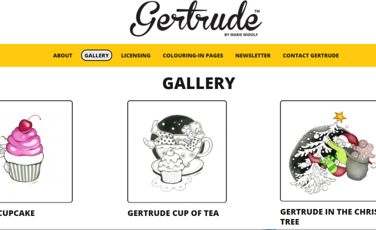
Website: gertrudebymariewidolf.com
Web Developer: Netshinefolio.com
Websites for artists (e.g., photographers, painters, and leather or wood artisans) have a distinct look and feel. They use plenty of visuals, specifically images and videos of their works. Very few are text-heavy. Many don’t blatantly advertise their services but focus instead on their artistic style.
These are just some common characteristics of artist websites. If you don’t have one yet, you’re probably thinking of making one. Now would be an excellent time to make a website: many people are now spending more hours online while on quarantine at home.
First Tip: Work with a Web Designer
If you know very little of website design, don’t try to do it on your own. Many artists make this blunder when making their first artist website. It’s natural to be proud of your artistic tastes and abilities. Still, web design is not the best venue to display that unless you have sufficient experience and knowledge about it.
Here’s what usually happens when creatives make their own websites:
- The aspect ratios of the backgrounds, banners, or sections they make are off the mark.
- Designs that look amazing on a 6R photo paper, for example, don’t have the same impact when stretched fully on a computer screen.
- High-definition image files are used for everything, using too much bandwidth and increasing page load time.
- There are plenty of inconsistencies, like unequal margins and variations in text sizes, orientations, division patterns, section sequences, header layout, and so forth.
- There is too much focus on the desktop experience that the mobile variation suffers and vice versa.
Seasoned website designers know to avoid these blunders. More importantly, they will also design with SEO in mind. That means they’ll optimise the web pages so that they load fast and have keyword-rich meta information, optimised URLs, and a well-designed page structure that makes sense to both humans and search engine crawlers. Hiring a professional web designer can, therefore, also grant you the benefits of website optimisation.
Second Tip: Make It Image Centric, Not Image Heavy
One of the biggest challenges of designing an artist website is balancing the need for on-page visuals and bandwidth limitations.
If you’re an artist, you’ll want to show off your creations. That means one handcrafted item could have multiple images, all taken from different angles and using different lenses (e.g., wide-angle shots, zoomed-in views). Posting lots of pictures is also an e-commerce tactic: many marketers can attest that using photos of real products and people instead of stock images can raise conversions and sales.
Here’s where working with a professional website design company adds another advantage: they have tools that can compress high-definition images into smaller-sized files while maintaining high image quality. They can make it so your website will be image-centric without being slower than a snail.
Third Tip: Add Your Personal Touches
What makes an artist’s website memorable and a standout? It’s the little, personalised details like the hand-written signature or initials at the bottom of every blog post, photo borders, buttons, page loading icons, and so forth. That also includes your website domain. Many artists, especially photographers, use their names for their URLs. It’s a smart branding strategy since it encourages potential clients to remember your name.
Feel free to get creative and design these tiny gems for your website. These customised touches can make your website feel put together, design-wise. If you’re aiming to impress visitors and establish your distinctive style, this is the way to do it.
A word to the wise: keeping the aesthetics of your website simple can create more impact. Your art or the pictures of your creations must be the focal point of your website. Everything else – the customised buttons, signatures, borders – must complement the main attractions, not steal the limelight.
Your website will serve as your gallery, virtual store, and marketing hub. Make the best possible version of it by finding professional web designers who can make your creative touches and trademarks pop on your website.
Want to learn more?
- Just starting out? CLICK HERE
- Been working in your business for two years or more? CLICK HERE
We’re here to help you to take action just like we’ve helped thousands of other entrepreneurs, business owners and creative professionals all around the globe.
Now is the time to let your passion SHINE.
Now is the time to Make Tomorrow Today!
To your success,
Vinh Van Lam & Stuart Horrex
Your Coaches ArtSHINE industries


