
Which Fall 2013 colour is your favourite?
Below is what Patone has to say about its top 10 colours of this year for Fall 2013 (September-December):
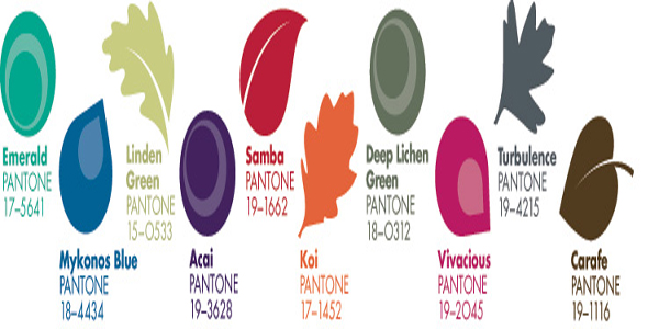
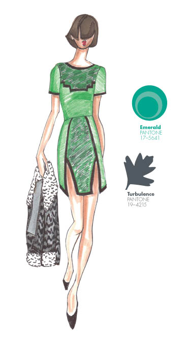
The colour Emerald is Patone colour of the year for 2013.
“This fall 2013 (September-December), designers express the many moods of fall with skillfully arranged collections that will enhance and enliven customers’ outlooks as the colder months set in. Similarly, colors come together to create moods that range from sophisticated and structured to lively and vivid, encapsulating our inherent need for wardrobe variety to reflect emotions that run from thoughtfully introspective to irrepressibly elated.
“Just as the leaves change in autumn, the consumer will enjoy the ability to change their ‘look’ and try a new approach to their wardrobe for brisk days ahead,” said Leatrice Eiseman, executive director of the Pantone Color Institute®. “The fall 2013 palette allows for that versatility and experimentation.”
[youtube id=”K9ctf-3NNps” width=”620″ height=”360″]
With the changing season, the greens from spring evolve and develop. MultifacetedEmerald continues to sparkle and fascinate, bringing luxury and elegance to the palette, while yellow-toned Linden Green brings a lightness and brightness to the deeper shades of fall. Try pairing both with Mykonos Blue, a bold, meditative blue, for a classic and relaxed fall look.
Exotic Acai adds mystery and richness to the palette, and can be incorporated with the other colors to create a number of powerful fall combinations. Pair the elegant shade of purple with Emerald for a regal disposition, or spirited Samba red for an expressive and dramatic look. Koi, a decorative orange with dazzling and shimmering qualities, is a statement color that serves as a pick-me-up for your wardrobe.Vivacious, an unruly and wildly deep fuchsia, adds an ebullient sensuality to the palette.
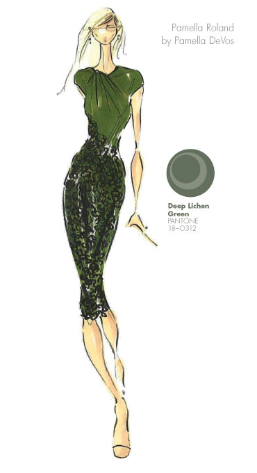
Pair Vivacious with anchoring Deep Lichen Green, a naturally lush shade of green, for a dynamic juxtaposition that captures both ends of the seasonal spectrum. Rounding out this season’s cornerstone colors, Turbulence, a dark mercurial gray, and Carafe, a rich, glamorous brown, provide more interesting and sophisticated alternatives to the black basics usually worn in colder months. Both staple neutrals pair gracefully with more expressive colors within the palette, such as Samba, Koi and Vivacious.
For more than 20 years, Pantone, the global authority on color, has surveyed the designers of New York Fashion Week and beyond to bring you the season’s most important color trends. This report previews the most prominent hues for fall 2013″.
Tune in next Thursday we will share with you the Mens Fashion colours for Fall 2013.
Images & Sources

